
Even though it has come and gone many times over those decades. Line was part of my artwork throughout my six years as an art student. It has appeared in many of my small models from 1974, some of which were constructed on a larger scale, such as “Trammel” and “Shift” from 1979 and “Lambeth Way” from 1980 to “Law’s Field” and “Windsor Field” from 1983.
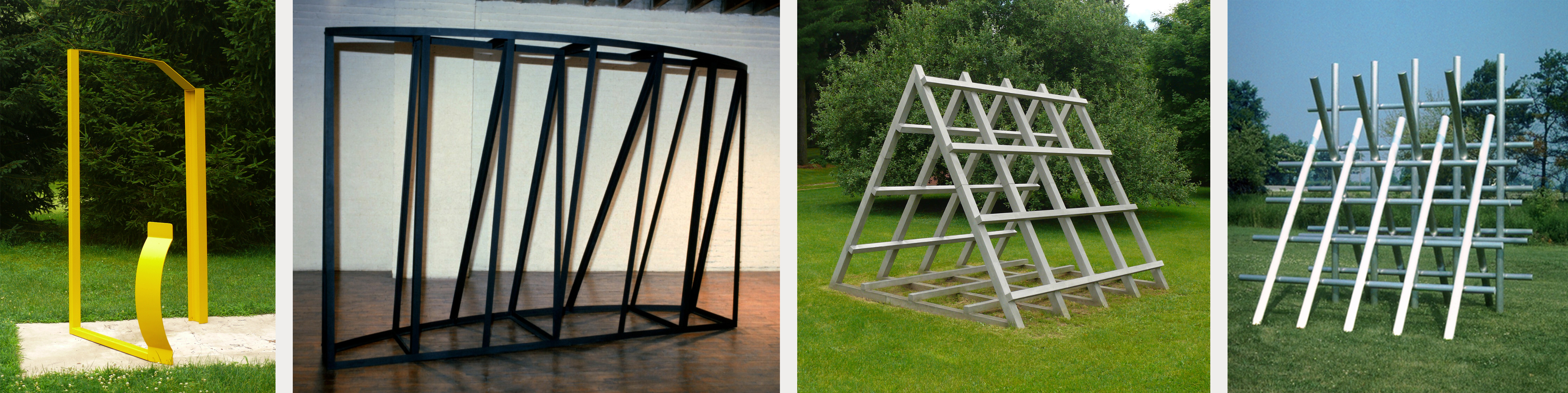
What characterized these sculptures was the use of straight lines to define the visual image. The use of line changed in 1997 from being used to construct an abstract composition to being used to construct a narrative as in “The Blue House.” In 1998, line was used to construct a monumental narrative when two eight-foot-tall wheels and a combination of two modeled arms formed an irregular linear element that held up the horizontal platform in the “Chariot of Anger” from 1998-2000. Line in 1999 was used to form the grid as a framing device for “Untitled (Jeff Sproul)”. In 1997 the linear element no longer defined the abstract composition but rather was a working element in the narrative sculptures.

Line as an abstract component re-emerged in 2011 with the copper sculptures titled, “Drift No.1” through to “Drift No.5”. Line was once again seen as an abstract component of the overall abstract composition and no longer used to define a representational component.
The use of line as subject matter entered my lexicon of work in full force with that body of work constructed using copper and tin as a material as in “Linear Composition No.3”. Now the line was truly the subject. Lines were created using a variety of methods as in “Linear composition No.4, No.5 and No.6” in December 2012.

The quality of line has changed frequently over the years from being fast and furious to being loosely defined as in “Linear composition No.6” in 2012. In 2013, the use of line became more organic as in “Crossings No.1 and No.2” and can be seen as the precursor to the “Wrap” series, completed between April 2016 and February 2017.
Over the years, the visual field of lines have gone from being simple or elementary as seen in the models from 1974 to the complex collection of lines as seen in “Crossings No.6” in 2013 and “Crossings No.13” from September 2013 to February 2014. The lines in 2011 moved from being straight to being curvilinear and continued in from “The Dance No.1” through to “The Dance No.3”. As 2014 wore on, the line became straight once again as in "Crosscurrent No.1", March 2014 to “Linear composition No.8 (Variation No.1)”, August 2014.
The important thing to understand is that the quality of line went from being smooth to being coarse to being smooth again. That change was determined by the body of work in which the lines appeared.
Throughout 2014 and 2015, the use of the line went through many changes as the work at hand required of it for the composition to be finished. At times the lines were carefully constructed, whereas at other times the quality of the lines changed from one part of the composition to the other as in “Trace No.1”, “Trace No.2”, and “Trace No.4”, all completed early in 2016.
A radical change occurred in April 2016 in how the line was not only produced but presented to the viewer. A second radical change that was introduced at that time in that body of sculptures was the re-emergence of strong colours, after having abandoned strong colours in 1974 for a truth to materials concept. In the spring of 2016, strong colours were ushered in as an emotional component of what became my lyrical constructions. Line was no longer a component of the composition; it was now the subject of the composition. Line was no longer in low relief but rather it reached out towards the viewer and occupied the viewer's physical space. The lyrical constructions that followed “Wrap No.1” explored the physical space around the sculptures.

The chosen colour(s) imparted an emotional value to the lyrical constructions. The various “Wrap” sculptures explored compression, expansion, twisting, and overlapping to offer different experiences to the viewer. At times, the various “Wrap” sculptures had their components form a tight core only to explode outward as in “Wrap No.4”. Visually, the audience was pulled into the core only to be thrown back from it as in “Wrap No.6”.
There are moments when the work is quiet and elegant as in “Wrap No.9” and “Wrap No.10”. Each configuration adopts a mood of its own from being quiet as in “Wrap No.8” to being noisy as in “Wrap No.15” and “Wrap No.17”.
As the series progressed, two different qualities of line were merged to create a visual lexicon of tension and movement across the composition as in “Wrap No. 12”, “Wrap No.14” and “Wrap No.16”. There were moments in the “Wrap” series where the line twisted and turned onto itself to create open centres. The focus of the composition was on the perimeter with the linear elements reaching into the open core/centre. These linear elements wiggled and danced towards the central open core of the composition as in “Wrap No.15” and “Wrap No.17”.
Another group of the “Wrap” series, “Wrap No.18” and “Wrap No.20”, pulled the viewer into a complex dense core. The series ended for the time being with the diptych “Wrap No.20”. It is important to understand that I spend a great deal of time thinking about the work at hand, even when some of the work happens and develops as I am working on it.
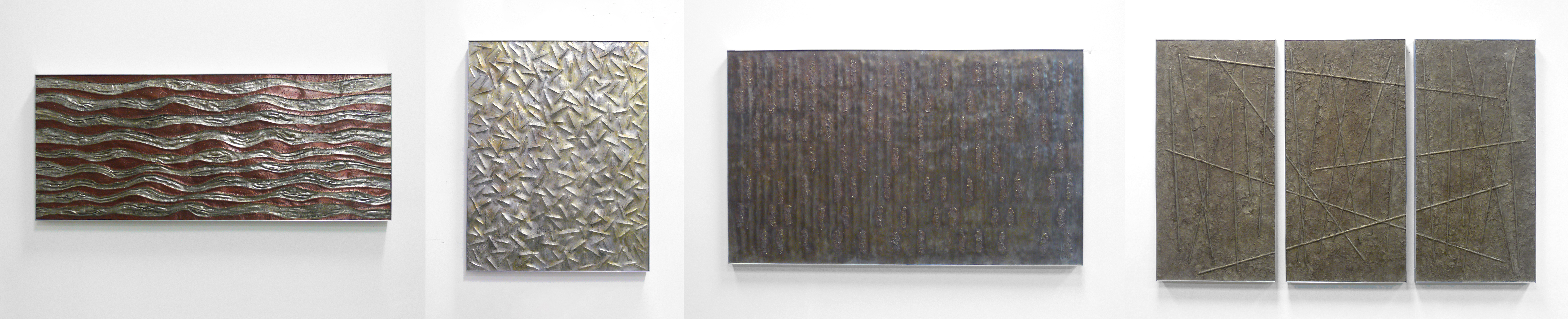
The different series of wall sculptures that followed, once again, saw line being supported by varying regular and irregular grounds. The linear elements continued to explore new ways of experiencing how line could interact with the grounds in the completion of a defined composition.
The ensuing series "Journey", "Linear Composition", "Nazca", "Fusion" and "Crossings" continued to explore the visual impact of strong chromatic colours. Within the different series line continued to have a prominent role in support of the dominant ground.

It was not until the “Crossings Rising” series that line, once again, shed the earlier supportive and at times dominating grounds. The linear components, much like the earlier “Wrap” series, strongly defined the composition and truly became the subject. With this new series came a shift in how line was used and presented.
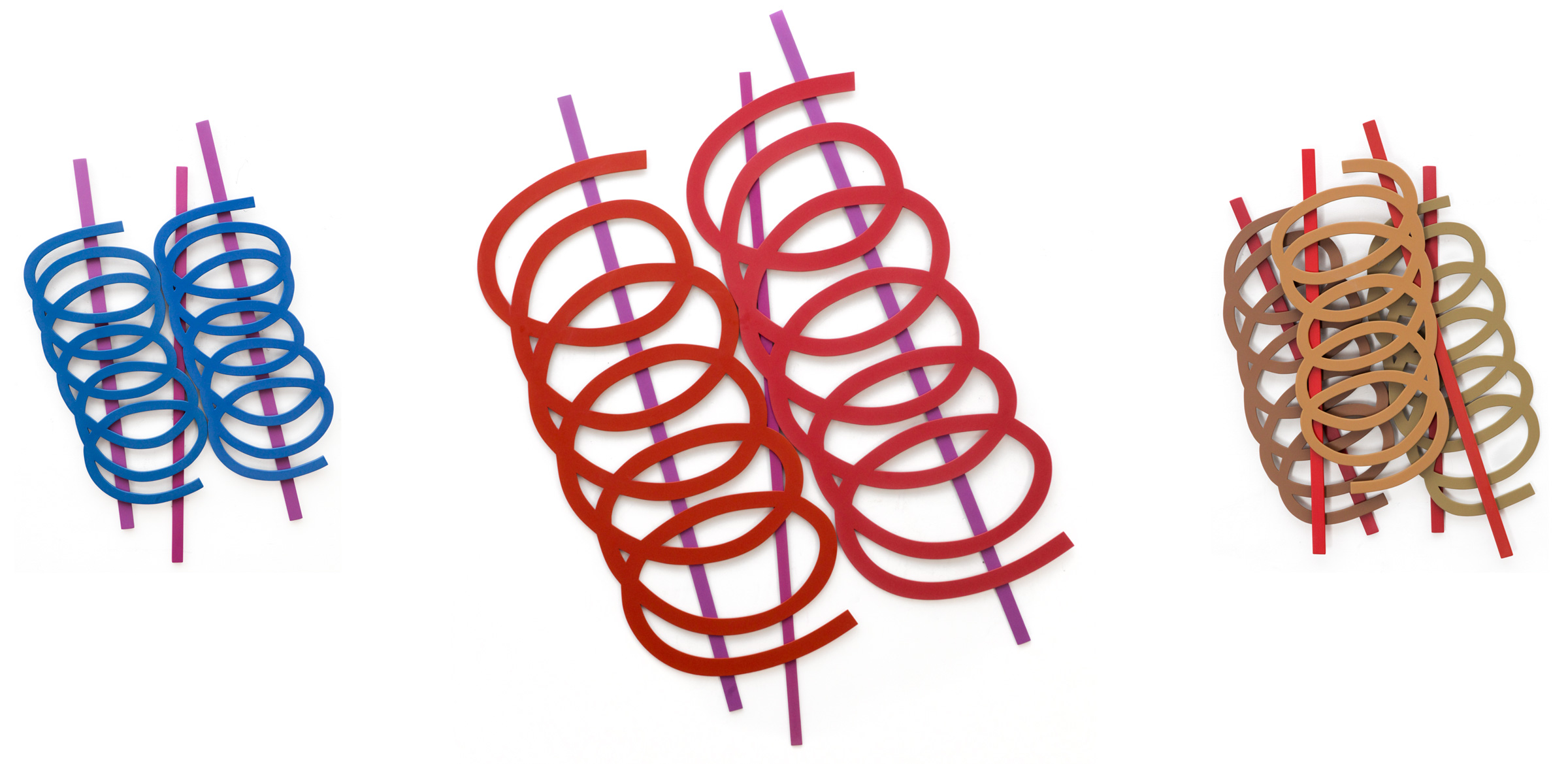
Where the linear elements of the “Wrap” series physically reached into the viewers physical space the new series has the linear elements hugging flatly to the wall. The layering of the lyrical and straight lines is organized in such a way as to create opposing diagonal movements.