
In retrospect, my studio activity can be seen as having three distinct periods. The studio activity that began in the pursuit of abstraction, that started as early as 1971, was altered during a long second phase from 1987 to 2010, in which image-based narratives, taken from daily life, defined the final work. The third working period commenced in March 2011 with the re-examination of abstraction and continues to this day.
The three distinct periods made use of different materials and processes to construct the sculptures. The sculpture I was working on at that moment defined which materials and process I was going to use.
All three working periods asked something different of me, as I moved from abstraction to image-based narrative work, that was approached perceptually and back to abstraction. The choice of materials and processes defined the final image in all three working periods, all the while resulting in work that was new for me.
Each abstract period presented a different approach to the final image. At times the work was very reductive while at other moments the sculptures were very expressive and more complex in terms of composition. My return to abstraction in the third working period, beginning in 2011, mirrored my early period in the use of line and interest in geometric abstraction.
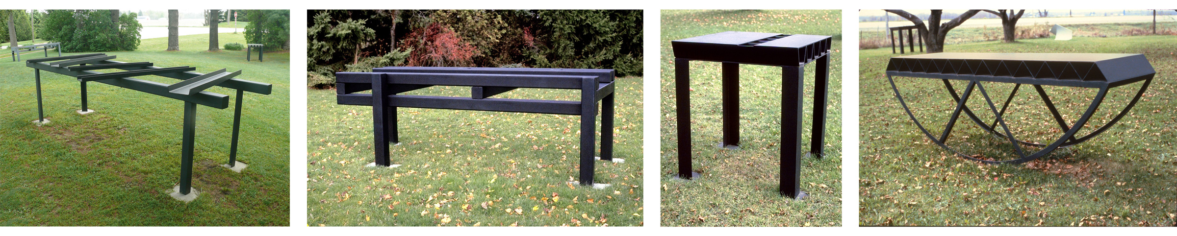
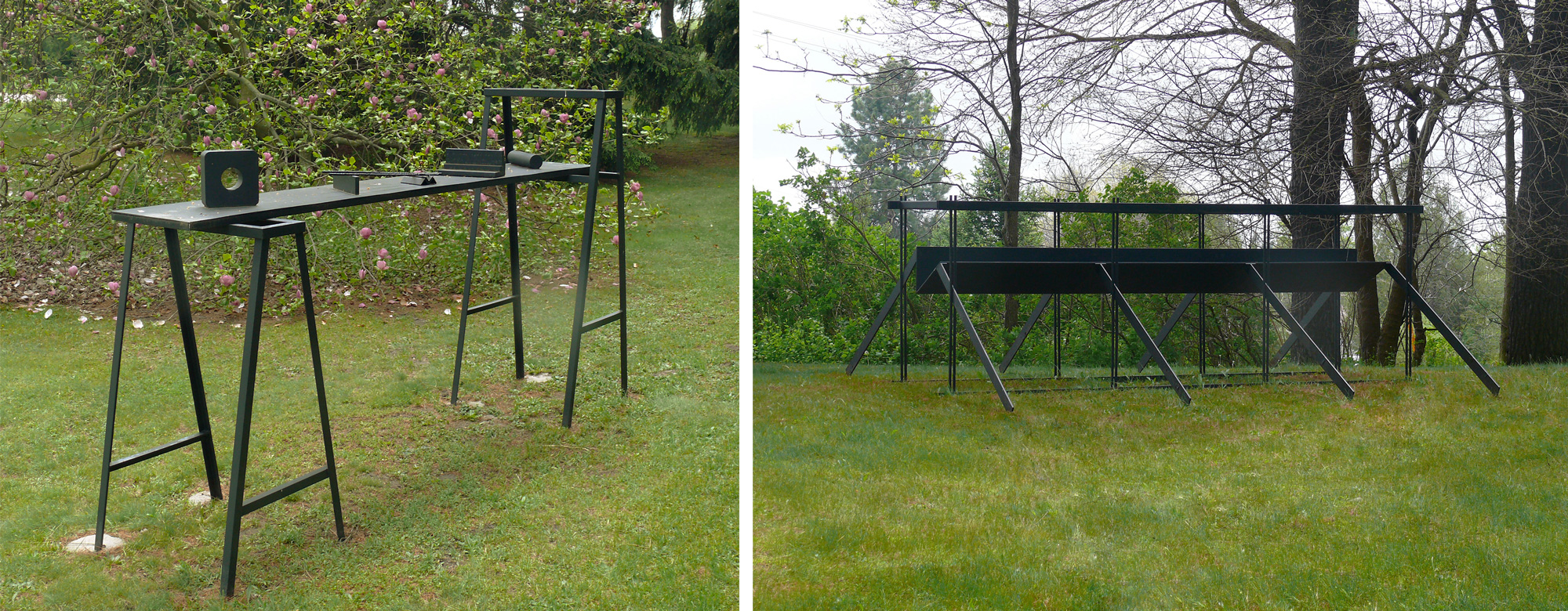
The first period focused on the abstract work I made between 1970 and 1987. During this period, the sculptures moved through several stages. I started with the manipulation of abstract forms, organic or geometric, with a specific idea/composition in mind. I then began to the use of abstract forms that started with or from a specific end product or image, such as the table in “The Table as Image as Structure” series. From there I moved to forms having architectural references, inside and outside, such as “Law’s Field”, June-July 1983 and “Windsor Field”, August-September 1983. And lastly, I used forms that developed from actual literal images of industrial buildings as in “Mt. Brydges Tower”, December 1986-February 1987; “Delaware Tower”, January-February 1987; and “Tower”,and “Images”, May-June 1987 as a means of expressing an idea. (5/28/87)
I started to develop an interest in the abstract tradition while I was studying fine art at the University of Windsor in Windsor, Ontario. That interest continued throughout graduate school at Florida State University in Tallahassee, Florida from 1972-1974. Abstraction defined my approach to sculpture as a final image.
Abstraction can be defined as stripped of time and place.
That approach to image making continued through to my linear constructions of 1983 and the free-standing structures of 1987 as in the "Tower" sculptures. During this period, my work incorporated both muted and strong chromatic colours and made use of line and plane. I was very interested in the tension between the positive and negative elements.
It was towards the end of the first period that I chose to abandon chromatic colours as a working element for a truth to materials dictum that lasted for many years. That decision came about in part from looking at the steel sculptures of David Smith. One can see the beginning of that thinking looking back at the “Prairie Divide” series that I made as a student at Florida State University in 1974. The original colours of the materials, aluminum, and plywood, that I was using in the construction of my work defined their final-coloured surfaces.

In late 1974, I built a few small linear constructions that had to do with illusion, such as the yellow-painted sculpture “Untitled”,1974. I continued to investigate linear sculptures on an off until the end of the first period in 1983 as in “Trammel”, May-September 1979; “Cat’s Cradle”, June-July 1981; and “Law’s Field”, June-July 1983. There was a greater emphasis on linear constructions during the latter part of this period.
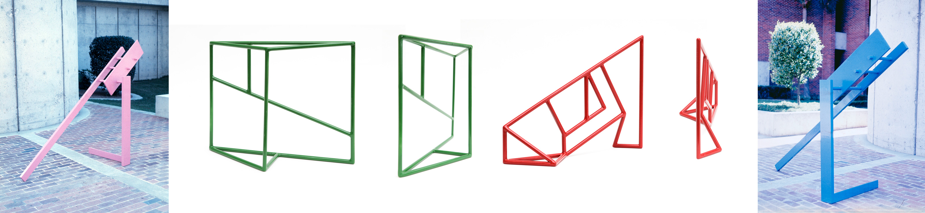
Billie and I made our first trip to Europe in May of 1982, spending two weeks in England and two weeks travelling through France, Italy, Germany and Holland. A good period of that time was going in and out of churches and art galleries and looking at the art on display. I was very much taken by the buttressing of medieval architecture. That interest appeared in some of my linear structures when I returned to our rented farmhouse west of Lambeth, Ontario. I introduced diagonal elements to my compositions as in “Queen’s Way”, July-August 1982 and “Carousel”, June 1982-February 1983. My interest in line was interjected with periods when I was interested in flat planes. That interest developed in the fall of 1974 when I had returned to Windsor after having studied at Florida State University and set up a studio in the old Burroughs Building. I started a series of sculptures in which flat planes were placed in opposition to each other and moved horizontally across the floor. It was during this period that I looked at colouring the structures that I was making. At first, the little models were made from scrap matt board cut-offs and eventually made from 22-gauge mild steel. Later, when I left Windsor and moved to London, Ontario, to teach at Fanshawe College of Applied Arts and Technology, I made five of those models out of ¼” mild steel and painted with acrylic lacquer as in “Kent”, July -November 1975; “Shaft”, September-November 1975, Bullet”, September-November 1975. Where the steel planar sculptures from 1975 were seen to move parallel to the ground, the aluminum sculptures of 1976 were seen as standing perpendicular. I saw all the sculptures produced between 1975 and 1976 as being only one-third in scale. I could not afford to build them on the final scale as there wasn’t any interest that would lead me to see constructing them on their intended scale.

I made a significant change in 1976 to how I presented the surfaces of my sculptures when I decided to abandon colour for a truth to materials dictum. This change came about in part from looking at the welded steel sculptures of the American sculptor David Smith and looking back at some of my earlier sculptures. The painted aluminum models were presented, after that decision, in their natural aluminum grey colour and exhibited that way in three different art galleries in 1976.
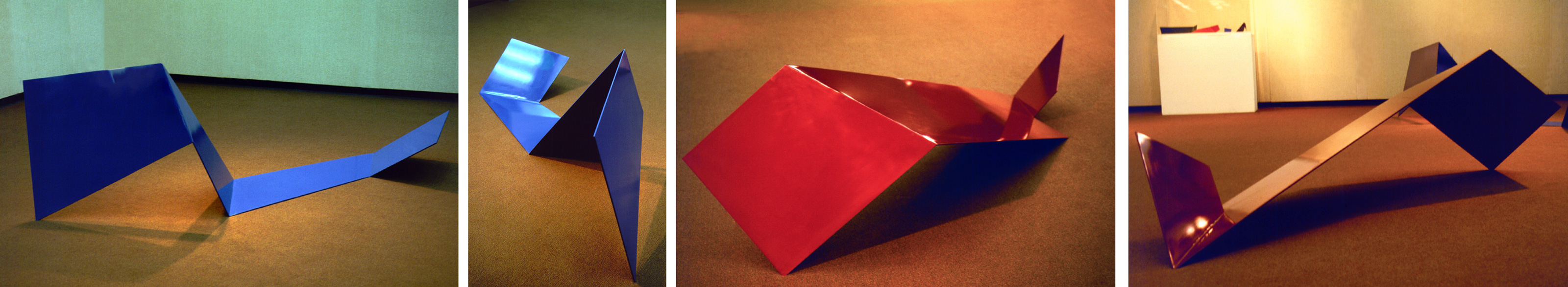
With “Wish No.3”, August-November 1976 and “Delph”, August-November1976, I placed one of the planes on a corner so as to touch the ground as a point to create a visual tension. With “Wish Nos.1-4”, 1976, the viewer was invited to enter the enclosed space, not unlike the painted linear sculpture “Passage”, September 1974-February 1975.

During 1975-1976, I briefly investigated wall-dependent, irregularly shaped planar constructions in which the various flat planes were layered and covered with iron powder (sintered steel) as in “Untitled, (Two Opposing Shapes and Two Planes)”, March 1976 and “Untitled, (Three Opposing Shapes and Three Planes)”, March 1976.
In time, my interest in line and plane came together when I constructed sculptures that combined both as in “Five Easy Pieces”, February-August 1980; “Lambeth Run”, February 1980-January 1981; and “Fanshawe Cradle”, July-August 1981.
The second period began in 1987 and continued until 2010 and ushered in image-based narrative work, such as “Images”, May-June 1987 and “An Eye for An Eye”, May 1988-August 1989. I traded the abstract tradition for the figurative tradition. However, not in a perceptual way but rather in a conceptual way. I was more interested in aspects of the body such as the face, the clenched fist and its extended arm than the whole figure per se. That period of activity produced work that was both free standing and wall dependent. The second period focused on the conceptual approach to portraits. It started with the sculpture titled “Images”, May-Jun 1987. That was followed by “An Eye for An Eye”, May 1988 - Aug 1989. The cut-out figures were two of my fine art students at Fanshawe College. The next series was about identity as seen through “The Portrait of the Artist” series.
With this body of work, I revived making small studies between 1988 and 1999, as a quick way to explore ideas. I constructed eight studies titled “Portrait of the Artist”. I made only one full scale, 12’h X 14’w X 10’d to test my ideas.

It was during this period that the process that defined how I worked made a 180-degree change. Until 1988, the materials and the processes that I used basically stayed the same with a few exceptions. With the “Portrait of the Artist” series, it was the images that stayed the same while I explored different materials and processes to realize the final sculpture. Images of my profile, a house, a pair of scissors, a stylized tree, and a bowl were repeated in a variety of ways as in “Portrait of the Artist: Homage to Cezanne, Series I, No.1”, November 1990-January 1991;“Portrait of the Artist, 1,2,3 Series I, No.1”, January-February 1992; “Portrait of the Artist”, May-August 1992; “Portrait of the Artist: Je suis/I am, Series II”, April-September 1993; and “In Transition”, February 1993-February 1994.
Phase two of my studio activity ushered in the use of symbols and metaphors to describe the work and complete the brief narratives.
The house and the bowl were seen by me as metaphors for the mind. The repeated tree as an image was seen as a symbol for nature. The closed scissor and mallet were used as symbols for labour.

It was during this period that the idea of sculptures done in series began to develop in earnest as a working strategy. Working in series gives an opportunity to develop the nuances of an idea, such as were expressed in “Portrait of the Artist, 1,2, 3,Series 1, No.1”, January-February 1992“. It was also a time to explore the image of Billie as subject matter. I kept the size of the ground constant (4’ X 4’) as well as the image size of Billie within the ground. These two elements were kept constant over the nine different panels that formed the “Billie” series. The approach to the surfaces changed from one panel to the next. Decisions on how to develop the surfaces were made very quickly while the work was in progress. It was with this series that I worked in earnest with iron powder (sintered steel).

It was after the “Billie” series that the triptych “The Girls” (Tori, Molly and Katie) was created. All three wall panels were created using iron powder (sintered steel) and fiberglass resin as a bonding agent. The surfaces were then treated with household vinegar to promote the varied rusted surfaces. These two bodies of work were the first in which the end result was determined using materials and processes to define the final image. The different processes offered very expressive surfaces. Chance as a working element was given full reign in determining the outcome.
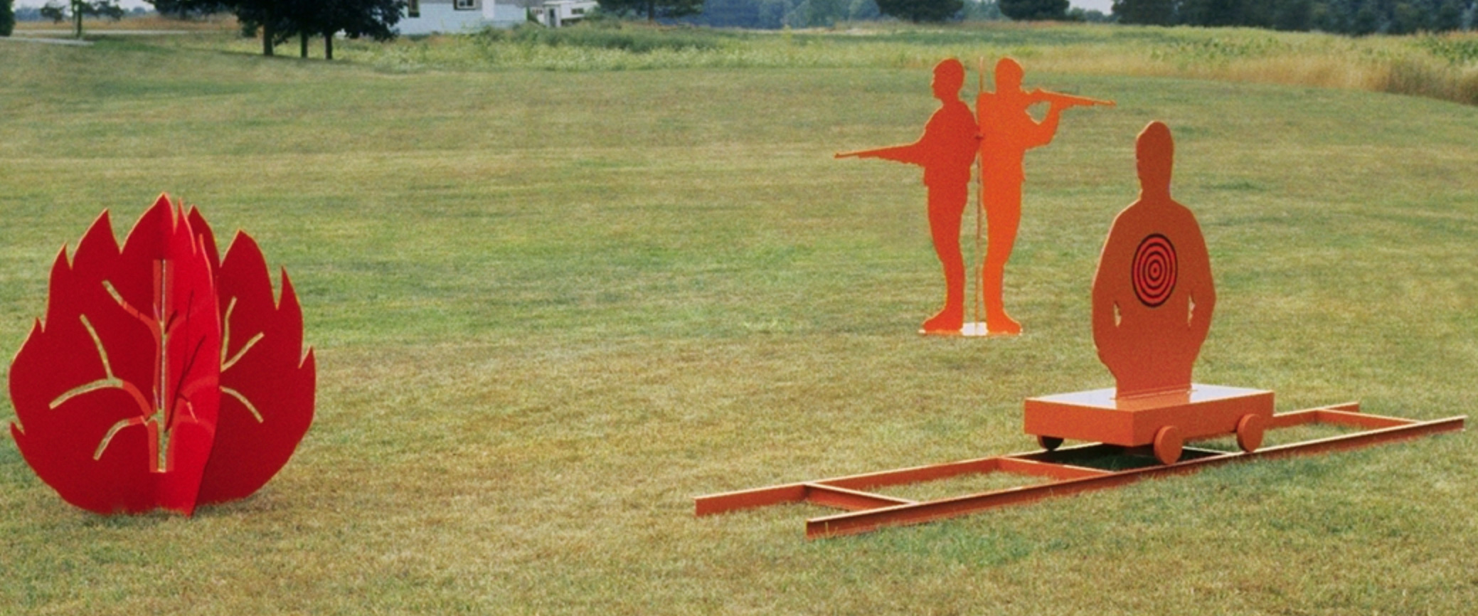
The subject matter for the next body of work focused on anger and rage. Once more, the sculptures were expressed both as wall-dependent sculptures and free-standing sculptures to present the works Red Angst”, April-May 1997; “Untitled (Jeff Sproul)”, February-November 1999; “The Blue House”, June-August 1997; and “The Chariot of Anger”, July 1998-August 2000. The “Chariot of Anger” was also about relationships.

That was followed by the “Icarus” series which was about taking risks in life. The Greek myth of Icarus was the initial impetus for this body of work as in “Icarus No.3”, November 2005-October 2006 and “Icarus No.7”, January 2007-February 2008. For the first time I made bronze models as studies for possible future larger versions. The series ended with the copper wall sculpture “Icarus No.8”, January 2009-April 2010. That sculpture also marked the end of the second period of my studio activity.

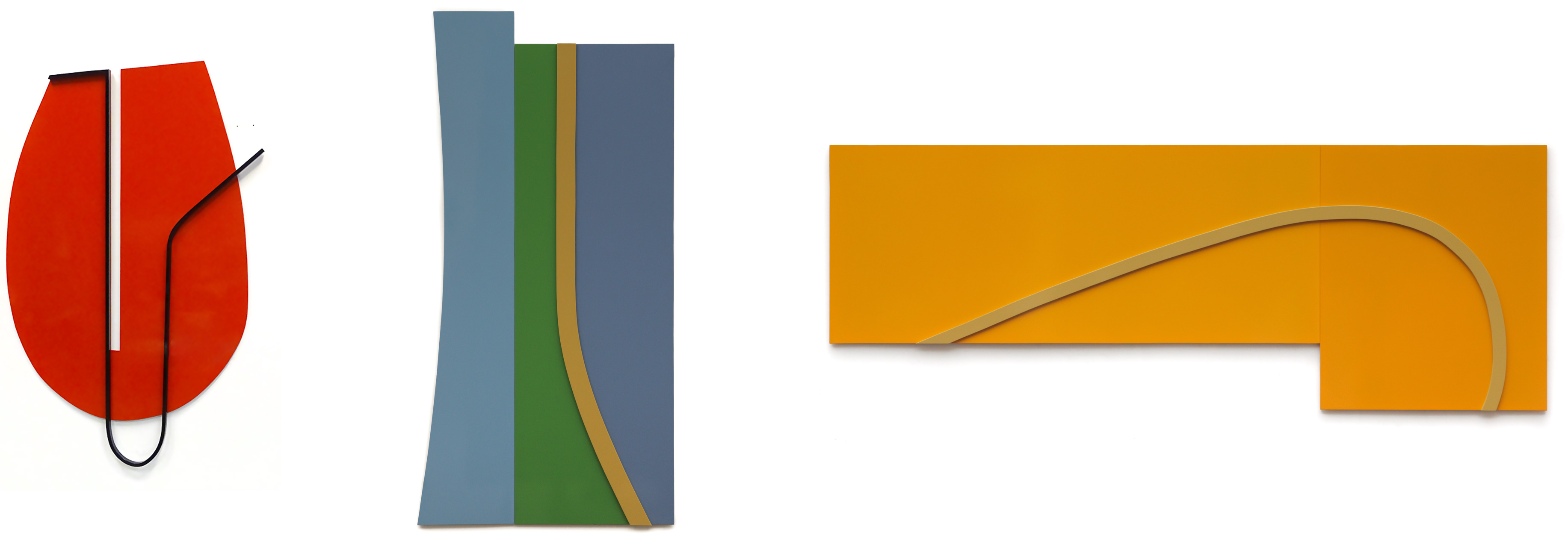
The third working period was marked by a re-examination of abstraction as a way of expressing myself. It could not, however, be as I had left it in 1986. It had to be different, or I was not interested. It had to be for me a fresh approach to abstraction, one that I had not examined before or at least in any great depth. This led me to re-examine the wall as a viable surface to express my ideas as a constant.
With the third period came a renewed interest in line, edge, plane, and the use of strong chromatic colours.
This third phase started in 2011 and continues to this day. The major change ushered in during this third period was in the rethinking of the role and impact of colour on the final sculpture.
With the third working period, I tried to expand my approach to abstraction. I attempted to reimagine other approaches and possibilities to arrive at a final image that I had not developed during the first period. This led to thinking and rethinking about the possibilities of abstraction as it has emerged and unfolded through my personal experiences.
For the first time, I introduced organic shapes that were formed by expanding copper sheets. By using wooden mallets through cut-out molds, I crushed the expanded mass to flatten the resulting form as in “Avanti: Square Series No.1”, March 2011. With the early body of work that was developed this way, I re-introduced the element of chance as a working process. I also introduced pattern that was both regular and irregular as a visual opposition to the strong organic shapes as in“Avanti: Circle Series No.12”, August-April 2011. Initially, I made many small wall sculptures that were seen as stand-alone works to explore my options. Some of these small sculptures could be increased in scale if there was an interest.

The main focus during this third period was on sculptures that were primarily wall dependent.
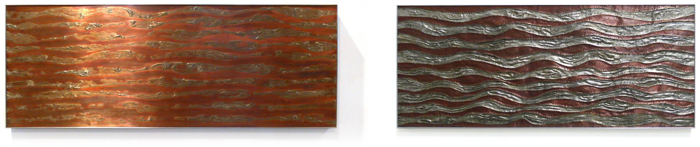
In time, copper, as a material, was combined with tin. The coloured surfaces were developed using liquid patinas of various chemical mixtures that I explored and expanded on. This process marked the subtle introduction of colour. The colours produced using chemical patinas were tonal in nature and not vibrant. In 2011, I introduced tin as a material to cover the copper surface to see how both of these materials, when combined, altered the compositions that I had in mind.
At one point, I became interested in creating a sense of very shallow space. I achieved this with “Linear Composition No.1”, August 2011 and “Linear Composition No.2”, October-November 2011 by creating a very dense field of short lines that were created using a cold chisel while striking the copper surface repeatedly. As a result, each line is slightly different. I also dimpled the copper surface using a six-inch nail to create a densely patterned copper surface, as in “Linear Composition No.3”, March 2012, to create that shallow depth of field that I was striving for. Both approaches to altering the surfaces were done randomly following a loosely marked surface using a Sharpie that indicated where to strike the copper surface.
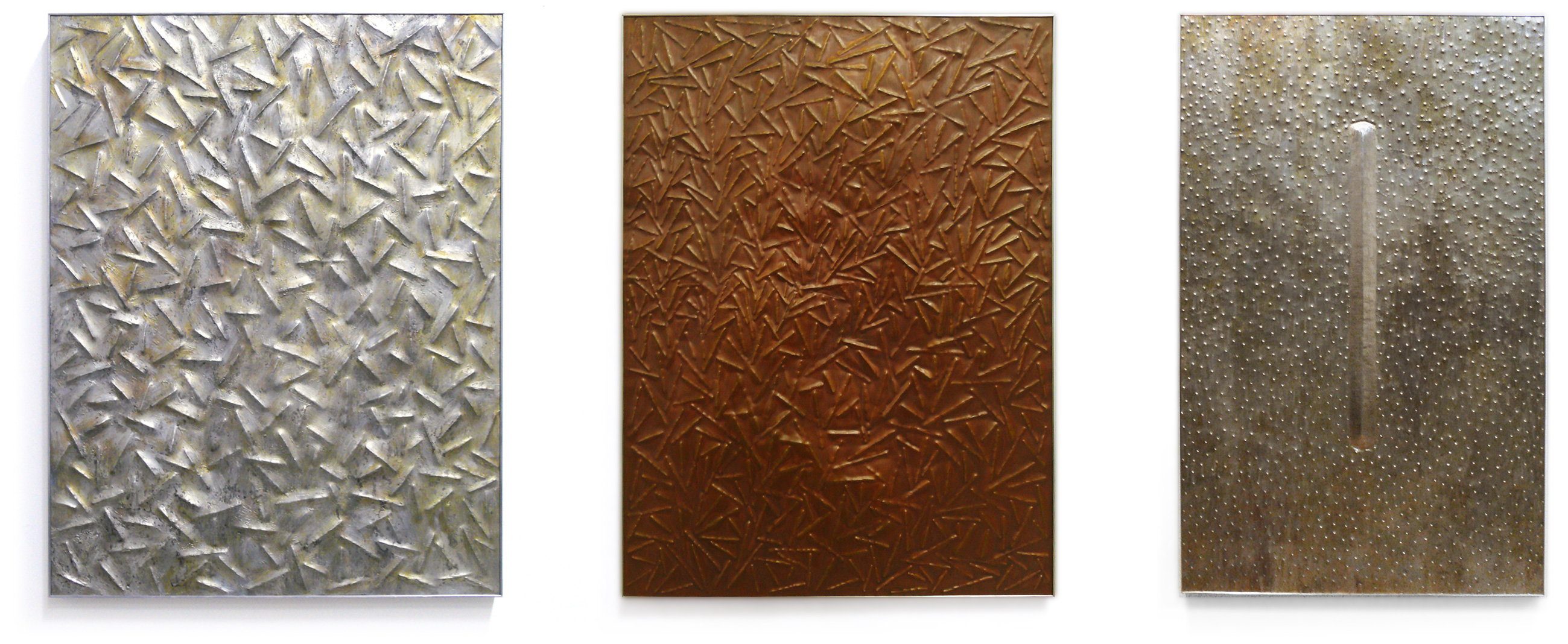
In time, I explored the visual impact of line(s) placed against an overall raised field. In “Linear Composition No.4”, August 2012; “Linear Composition No.5”, August-September 2012; and Linear Composition No.6”, November-December 2012, I used the repeated raised pattern created by identical lengths of short rope. A copper sheet was laid across the rope that was seated in a mold that I made to hold the rope pieces. The copper was then hammered with a large wooden mallet to obtain the image of the rope that defined an irregular grid. The different thicknesses of copper sheets allowed for different heights of the expanded, raised surfaces.

At one point, as the sculptures developed, I introduced irregular curvilinear lines that were placed against an overall irregular field. When the copper was combined with tin, the surface was continually worked and reworked. Frequently, I worked with the tin when it was molten to create some very irregular surfaces that would be impossible to duplicate as in “Crossings No.6”, April 2013 and “Crossings No.12”, September 2013-February 2014. It goes without saying that the element of chance played a strong part in the final composition’s image, as I was making second-by-second decisions while I worked while the metal was still molten.

Several wall sculptures were created that explored the raw copper that was placed in opposition to the untreated, and at other times chemically treated, tin surface(s). In 2011 and 2014,I reintroduced irregular grounds in which the flat plane appeared to optically warp as in “The Dance No.1”, February-March 2014 and “Linear Composition No.11”, February-March 2015. During this time, I created many compositions with coloured linear components that were placed in opposition to the flat coloured planes created using chemical patinas.

In March 2016, I had a one-person exhibition at the DNA artspace Gallery in London, Ontario in which I exhibited 25 works made up of my wall-dependent sculptures and their related drawings. The exhibition covered both floors of the gallery. When I walked through that exhibition alone and looked around me, I decided that it was time for another radical change. That radical change was the reintroduction of strong colours on my sculptures after having dismissed colour for many years.
The subtle, tonal colours that were produced by the chemical patinas were now replaced with strong, vibrant colours created by powder coating the aluminum surfaces.
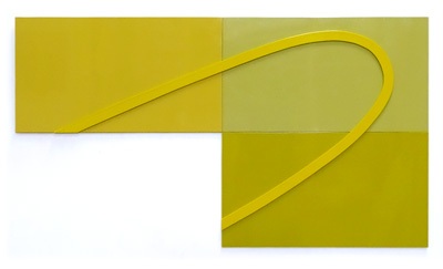
The second major change that came to my studio activity was the development and forming of lyrical constructions as seen in the “Wrap” series. With this series came an interest in providing compositions that were constantly changing. At any moment the lyrical construction could expand and move out towards the viewer only to come back on itself as in “Wrap No.3”, April 2016. These constructions challenged the viewer’s physical space in a way earlier works did not. As the series developed,the lyrical construction changed from a tight core composition only to open up and have the linear elements move around the perimeter of the composition leaving a large open core as in “Wrap No.10”, July 2016. I worked throughout 2016 constructing abstract lyrical linear constructions, with the last in the series ending with “Wrap No.20” in February 2017.

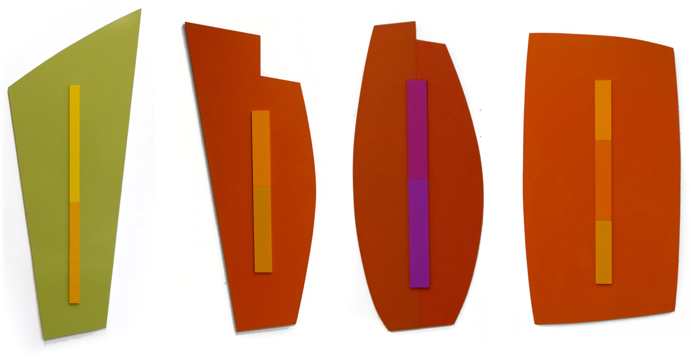
As I was nearing the end of 2016, I decided to once again make yet another major change in my studio activity. I put aside my investigation of lyrical abstraction in favour of reintroducing large open planes. For my wall-dependent sculptures, I also reintroduced irregularly shaped grounds. This time I introduced flat curvilinear lines to play in opposition to the large, open flat planes. The linear components divided the large open areas into several unequal areas creating a tension between the linear elements and the larger flat planes as in “Journey No.2”, April 2017. The singular grounds changed from regular and irregular geometric planes to organic planes as in “Journey No.9”, October-November 2017.

After a trip to Peru to see the ancient city of Machu Pichu, high in the Andes, I started to stack my organic shapes so that they formed multiple grounds for the interplay of the coloured curvilinear elements as in “Inca No.1”, March-April 2018. That trip to South America took me further west to Lima, Peru to see the Nazca Lines that the ancient Nazca people drew into the desert floor. As an outcome of flying over and experiencing the Nazca Lines, I started to introduce multiple linear components that were placed in opposition to the flat coloured plane as in “Inca No.2”, April 2018. In time, the singular-coloured field was replaced with multiple-coloured fields over which truncated triangular linear shapes were placed in opposition to the flat grounds to create a greater active visual field as in “Nazca No.4”, February 2019.

By the end of 2019, I had once again focused on the visual tension of a singular line placed in opposition to a larger open field. My interest and, in time, obsession continued to expand and build on the tension created in “Journey No.13”, November-December 2019. In the “Nazca” series, I explored multiple-coloured grounds that in time I repeated with the “Journey”series. Throughout the year, I went back and forth using both singular and multiple-coloured grounds. To break with the predictable regularity of the geometric shapes, I once again cut into the ground to offer a different shape to define the ground as in “Journey No.6”, October-November 2017. From 2017 onwards, edge became very important as the shapes of the grounds changed as in “Crossings No.13”, February-March 2017 and “Journey No.14”, December 2019-January 2020.
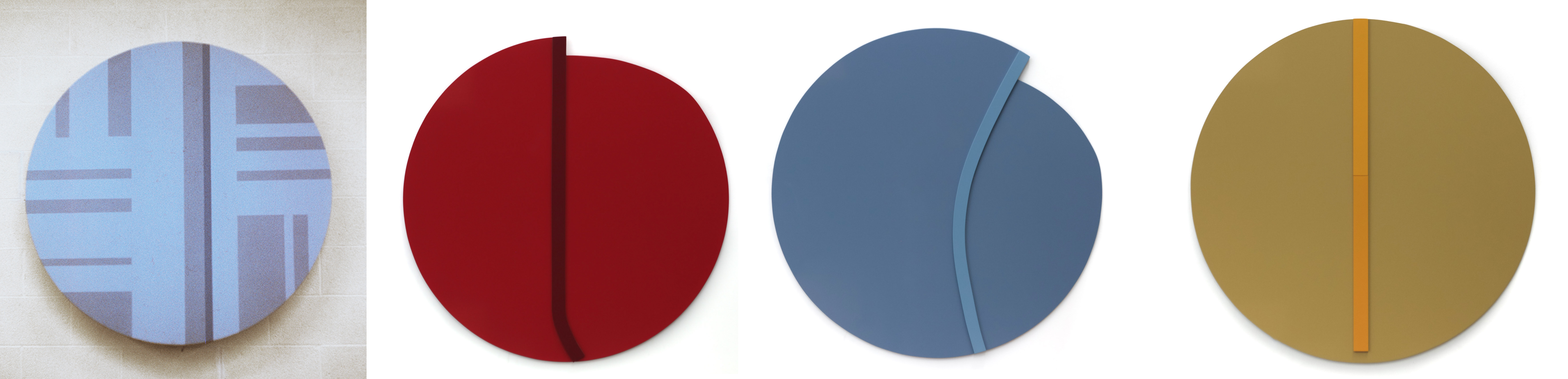
In 2020, I constructed a number of tondos, a shape I first used as a student at the University of Windsor in 1970 for one of my paintings. I felt that the tondo as a shape would work well with what I was currently doing in the studio as in “Journey No.18”, August 2020; “Journey No.20”, August 2020; and “Fusion No.3”, August-September 2020.
During 2020 and 2021, I explored work in which the ground was not flat and parallel to the wall but rather partially raised.
With “Journey No.22”, December 2022 I rolled one of the bottom corners upwards and away from the wall moving into the viewer’s physical space. I had the back of the wall sculpture powder coated the same colour as the linear element on the front of the sculpture, visually tying both surfaces.
A new series developed out of the Journey series in April 2020 titled, “Fusion”. The “Journey" series was characteristically marked by a single line, of one colour, that moved across an open field. With “Fusion”, the linear element moving across the large open field now consisted of two linear elements with two different colours butted together to form one elongated linear element interacting with the ground. The first of the series, “Fusion No.1” April 2020 developed as a pastel powder study as did “Fusion No.2”, June 2020. “Fusion No.3”, August-September 2020 broke with my interest in rectangular or irregular geometric shapes as grounds by introducing the tondo as a format for the linear elements to form the final composition.

The butted, vertical, linear components that marked the first three “Fusion” wall dependent sculptures developed into two irregular geometric planes that were placed side by side as in “Fusion No.4”, December 2020. With this sculpture I introduced a curved surface that the two irregular planes visually operated on. The idea initially was to have the ground that normally sat flat and parallel to the wall now subtlety projecting forward into the viewers physical space.
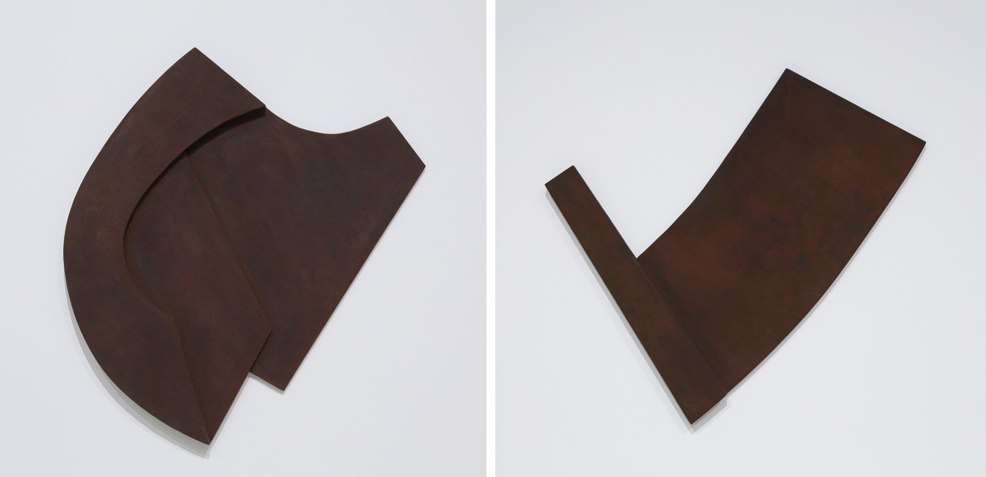
Doing so led to the exploration of a ground that was curved with a subtle arc and stood 1 3/8" away from the wall at the apex. Doing so was the outcome of a small steel study I made in 1976 that I stared at for many decades, not being sure how or where to go with it. It seemed that “Fusion No.4 and No.5”, of the new “Fusion” series was the answer to all those years of looking at this small 22-gauge, mild-steel relief that I had spot welded, when I was using a spot welder in 1976, to make a number of small 22-gauge, mild steel, models as studies.
The first was “Fusion No.4”, December 2020. The nearly square colour field was curved very slightly. It was only 1 3/8”away from the wall at the apex. The composition of “Fusion No.5”, February 2021 was more rectangular and had a greater arc that was 4 ½” away from the wall at the apex. Each of these compositions had two small geometric shapes in the near centre of the large field butting each other.
In March 2021, I introduced illusion to the overall visual field. It had to do with the shape of the two grounds that were placedside by side as in “Fusion No.7”, March-April 2021. To accomplish this, I made the panel of the far-right side 2” higher than that of the left-side panel. Here is where colour enhanced the visual illusion of a warped surface/field that was moving visually forward towards the viewer.
As 2022 unfolded I continued to explore the visual impact that irregular grounds offered the viewer as in “Fusion Nos. 8,9,10and 11”. These four sculptures picked up on the “Crossings” series constructed in 2021 in which the positioning of the ground was tilted and sitting on one of its corners creating a visual tension between the fused lines and the ground.
The years 2020 through 2022 saw several series come and go only to return when something different could be done to develop any series further.
This is why, I never call a series ended as any series can return when something new can be done to take the series one step further to experience the series in a new and fresh way.

The years 2021 and 2022 saw the “Crossings” wall sculptures inverted and positioned with one of their corners pointing towards the floor as in “Crossings No.17”, October 2021 and “Crossings No.18”, November 2021 and “Crossings No.19”, April 2022. The focus with these wall dependent sculptures was on the four corners that were turned up, all to create a greater sense of visual tension. The curvilinear components that cross the large open field were added to visually connect with the two curved edges of the three “Crossings” sculptures.
“Journey” as a series, first begun in January 2017, has continued on and off in one form or another through August 2021 with “Journey No.23”. The Journey series with its characteristic singular line has developed in many different ways from having a singular line moving across a single-coloured ground to having the signature single line move across several grounds. “Journey No.22", December 2020 saw the bottom left corner turned up moving into the viewers physical space. The idea was to connect the back of the sculpture with the front of the sculpture. The back of the upturned corner is the same colour as the single vertical line moving across the large open field thus visually bringing the front and the back of the sculpture together as part of the visual understanding of the sculpture.
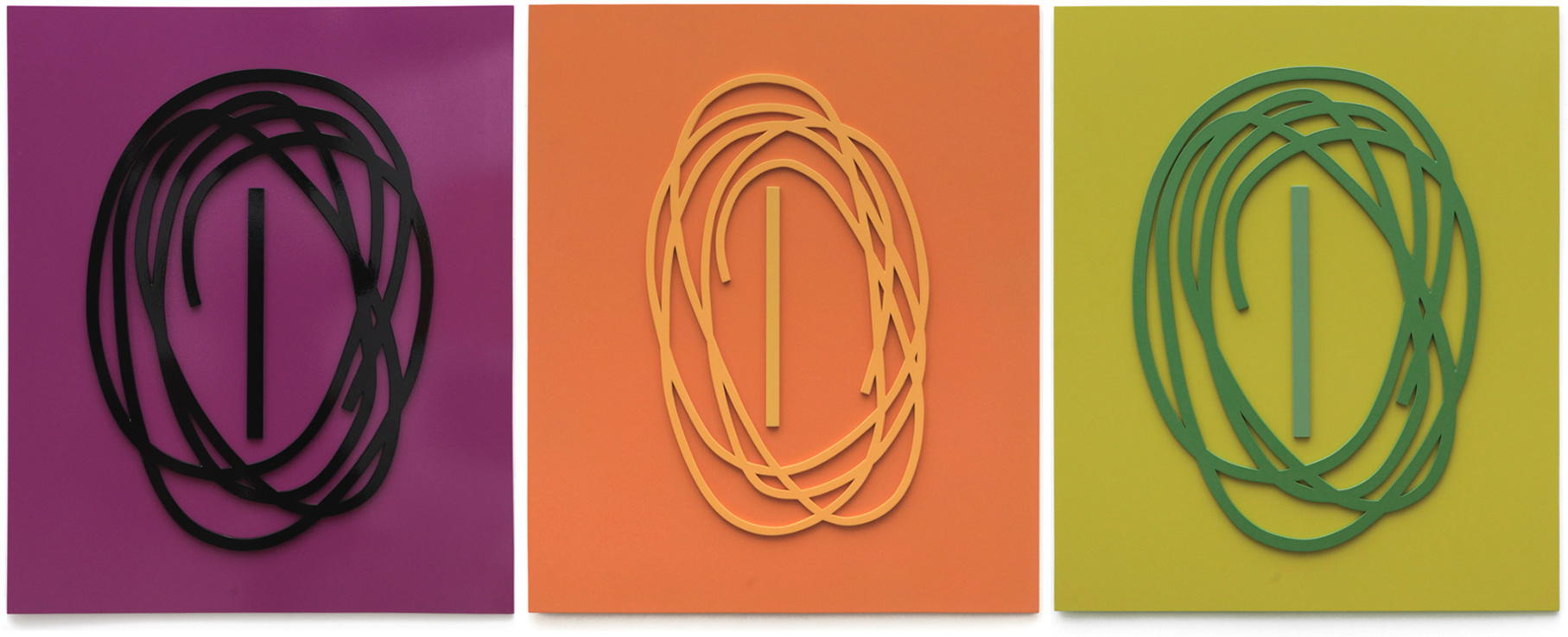
In keeping with my periodic re-examination of older series of sculptures, I re-visited “Crossings No.4”, 2013. The composition consisted of a continuous lyrical line filling a great deal of the ground expanding in all directions towards the four edges. The centre of the composition had a long straight line anchoring the open centre. In 2013, the sculpture was formed combining copper and tin to complete the image. With the advent of returning to using strong chromatic colours in 2015, over aluminum surfaces, I decided to once again explore “Crossings No.4”, 2013 as a composition to continue exploring my lifelong interest in line. From May-June 2023 to March-April 2024 I constructed four versions titled “Crossings No.4 (variations Nos. 6,7,8, and 9), 2023. Not only did the colours change from one version to the next but so did the weight of line that moved across the ground. These four wall sculptures maintained the vertical composition of the initial one constructed in 2013. With the last version “Crossings No.4”2023 came a change in how the composition was presented.
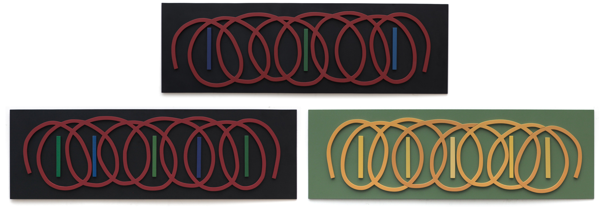
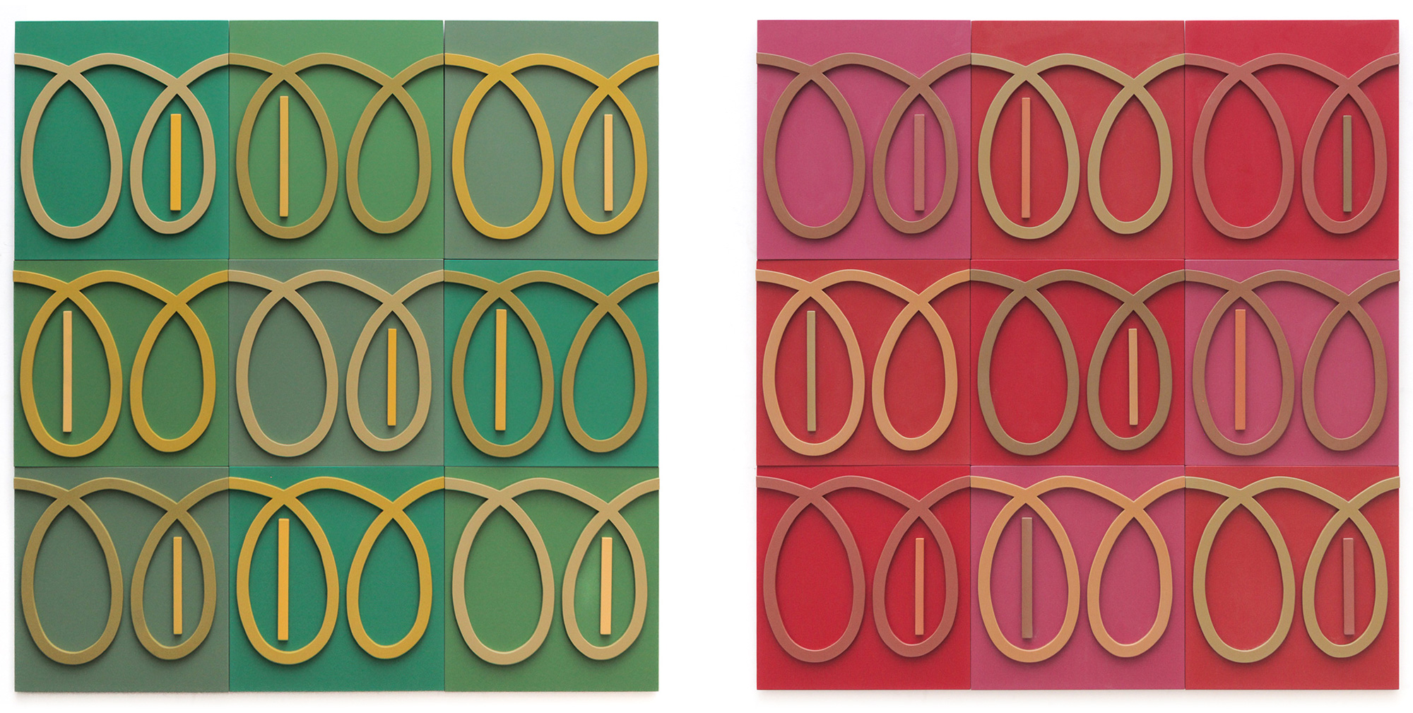
With the new series titled, “Crossings Unfolding”, the composition expanded horizontally as in "Crossings Unfolding" No. 1 to 3, 2023 to 2024. The compressed, continuous lyrical line now unfolded into a more open and expanding set of loops as they moved across the narrow open ground. The new series also presented a number of short vertical lines, from three to five, with the idea of offering more vertical points of tension to offset the expanding lyrical lines. “Crossings Unfolding” offered more opportunities to introduce a greater number of colours to visually interact with. The kaleidoscope of colours prevailed that added a richness to the composition. The first three wall sculptures in this series developed between October 2023 and April 2024.
"Crossings Unfolding No.4”, July-August 2024 witnessed a return to my interest in the grid to structure a composition. Each of the nine small grounds had a repeated lyrical double loop, moving across the open field with the ending of the double loop connecting to the beginning of the next double loop. This was repeated nine times to complete the composition. The nine grounds were given three different colours as did the three sets of double loops. With this sculpture, I introduced nine short, straight lines of different lengths and widths. They too were given three different colours to interact with the remainder of the composition. Once again, the viewer is presented with a kaleidoscope of colours.
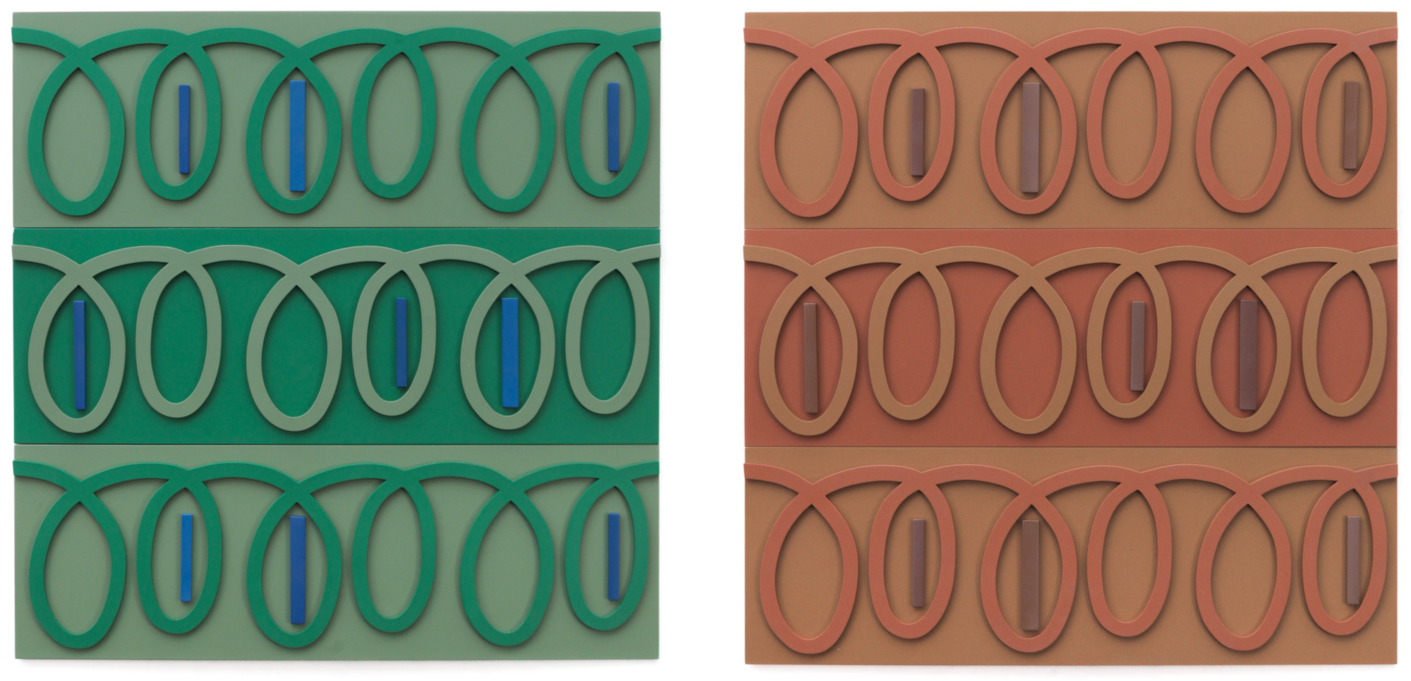
The grid, as a format, in "Crossings Unfolding No. 4" expanded horizontally in the "Crossings Unfolding No. 6" composition. The basic repeated double loop unit this time, as in No. 4, touched once again the beginnings and the ends. However, the traditional grid format in "Crossings Unfolding No. 6" was now presented as a layered, horizontal mix. In it, the basic double unit continued from left to right as it moved horizontally across the lateral field.
The next development in the Crossings series, “Crossings Rising”, presents the lyrical line not horizontally but rather diagonally. The new compositions break with the previous work in that the linear elements are no longer attached to a defined ground, as in the earlier “Wrap” series of 2016-2017, but rasher move freely diagonally across the open wall surface as in “Crossings Rising Nos. 1- 4”, 2025.
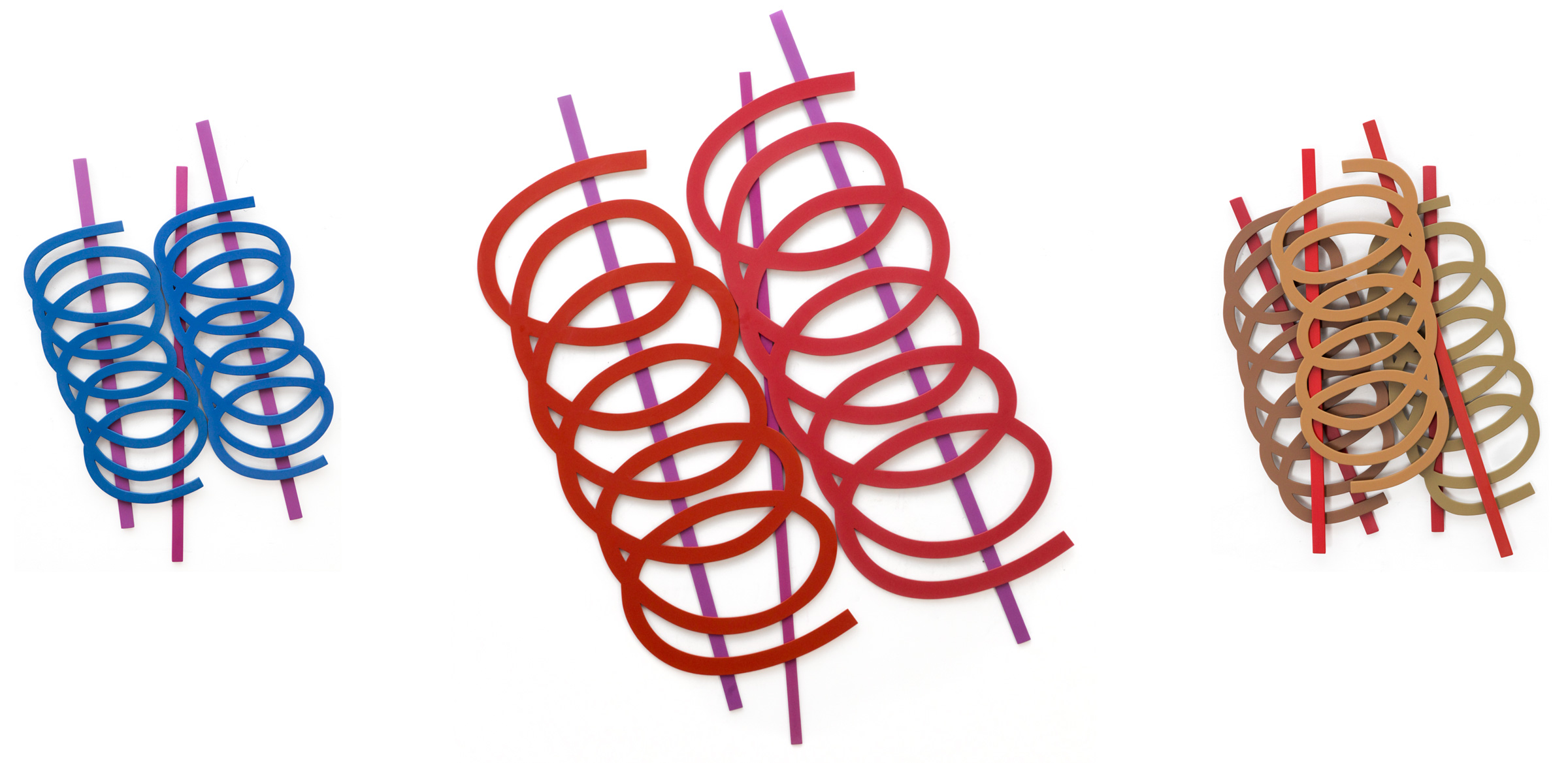
The lyrical and straight lines are in some ways freed of the visual constraints imposed by the defined edges of the ground. As a result, the linear elements appear to move into space unencumbered by the edges of a normal ground creating a more open composition.